
\
Monochrome photography plays to a certain audience who desire a certain look for their interior designs. In a sense it is photography in its purest form relying on a pleasing variations of tones.
In the digital age any color photo can be desaturated of its colors to render a black and white Show allphoto.
1. Almost all photo editing programs have the ability to convert a photo to black and white. It is generally as easy as clicking a button to desaturate an image. But once you achieve this does the image reflect what you desire?
2. And in many programs you have choices. You could choose sepia, bluish tints, straight black and white etc. The style you choose is up to you. And although it may seem like an easy conversion there are many things to consider.
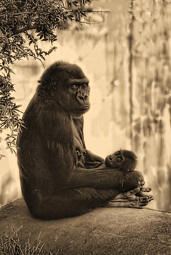
3. In the above photo a slight hint of sepia has been blended in the layers. To reach the point that I found pleasing. I used the black and white adjustment filter in Photoshop and added a slight yellowish tint. I used restraint in the amount of color mainly because a deeper sepia tone would obsure detail that I had carefully brought out in the image.
4. In monochrome photography without a color pallet you depend on tonal contrast to make emphasis, and impact. Striking monochrome photography relies on drama to capture the audience.
5. In the above photo the penetrating stare by both the mother and the baby influenced my decision to capitalize on the drama of the scene. But drama can take many forms and it could be just the relationship of light and darkness that makes a photograph a good candidate to be a monochrome image.

6. In this photo the tonal contrasts between the light and dark elements of the photograph was my deciding factor on processing this photograph as black and white. To emphasis the drama my choice was not to add any tinting to the photo. I decided on the sharpness of the black and white to be the major elements of interest in the photo.
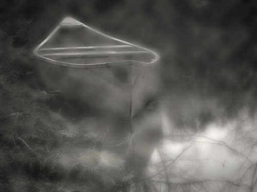
7. Sharpness is not always the deciding factor on choosing which photos to convert to monochrome. In this photo I chose to use the softness of the photo to draw on a sense of mystery. The blurring of the tonal contrast is what I think makes this photo pleasing. As well as effect of fog on the dappled light.

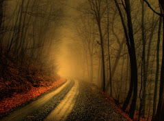
8. Sometimes less information can be more. This photograph in color would not have near the impact of a black and white image. The dramatic impulse of the deep black and whites was the deciding factors in converting this photo to black and white. The color version of this photo would have been completely unappealing.
9. My personal experience with black and white as opposed to color photography is that it appeals to a smaller audience. But, often the audience is more upscale in the prices that they will pay for good monochrome images. There is also a certain intrinsic reward in creating a beautiful image without the use of a large color palette.
10. I encourage you to experiment and not always think in terms of color. You may be passing up opportunities that you might just overlook if you do not look into black and white possibilities.


No comments:
Post a Comment